A memory app wearing weather's clothes.
Building Dayfall with three Claudes — and what a weather page taught me about product voice, color systems, one spectacular browser freeze, and what it takes to get 530 days of history right.
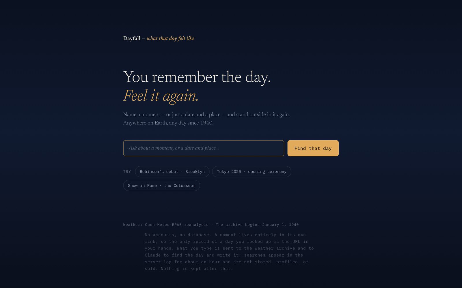
Dayfall takes a moment — "Jackie Robinson's debut," or your wedding day, or just a date and a place — and shows you what that day felt like: a satellite photo of the spot, a short piece of prose about the weather written like a memory, and a band of the day's light you can scrub with your finger. Try it at dayfall.app, then send a day to someone who was there with you. That send is the whole product.
The idea
Every weather app tells you what tomorrow holds. Nothing tells you what a day in your past felt like — the day you got married, the day your kid was born, the day it snowed on the Colosseum.
The framing that decided everything downstream: this is a memory app wearing weather's clothes. The user brings the moment. The weather is the sensory key that puts them back in their body on that day. "It was raining that morning" does something to a memory that a photo doesn't.
If sharing is the growth motion — you look up a meaningful day and send the link to someone who was there — then every moment has to be a permanent, stateless link. So a personal moment lives entirely in its URL: place, date, coordinates, nothing else. No accounts, no stored history. The one database that arrived later holds the written testimony (the day happened once; it gets written once) and the public corpus described further down — never who you are or what you typed. The privacy note on every page says exactly that, in one sentence, because I cut it to one.
Prose first, numbers as texture
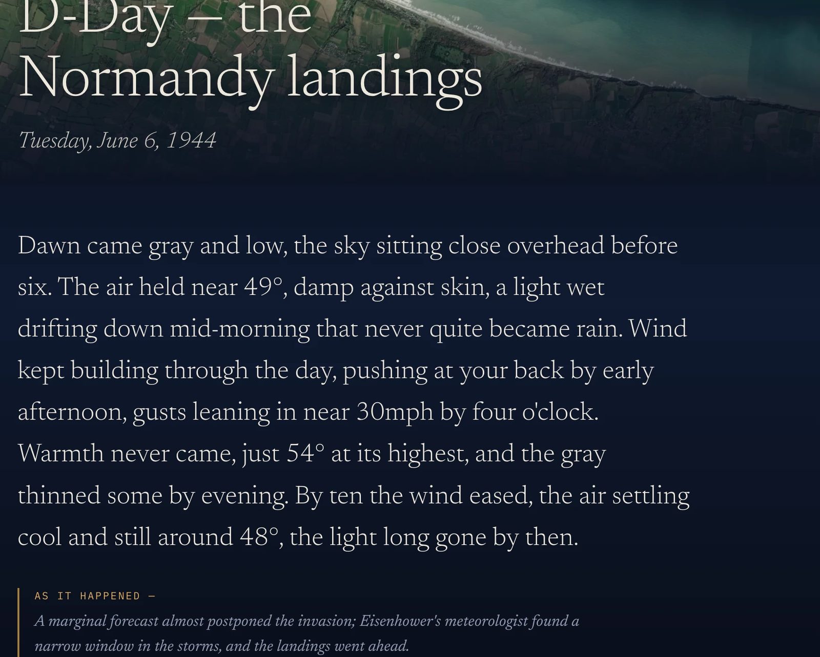
The first product law: the output must read like testimony, not a forecast. Precision is for forecasts; history wants adjectives.
The prose is written by Claude per moment and cached forever — the day happened once, it gets written once. The prompt is the voice, and I treated it like product code: it lives in the spec, it's versioned, and it took eleven revisions to get right. The prompt's core conceit is a set of blindfold rules: the writer knows only what a body could feel. Temperature on skin, wind, wet, the quality of light through closed eyes. Nothing invented — no petrichor unless it rained, no seasonal language the hemisphere doesn't support.
My favorite iterations, because each one came from a real failure on a real page:
- The six-comma budget. Early drafts were beautiful and breathless — clause after clause, the model showing off. The fix wasn't "write simply" (too vague to hold); it was a hard number: six commas across the whole paragraph, counted before finishing. Constraints beat adjectives when you're directing a model.
- "A thin wet moved through." The model loved pressing adjectives into nouns — "a fine damp." Sounds like weather, means nothing. New rule: every image must survive the question what does that feel like?
- "The night." Paragraphs about pre-dawn hours kept opening with "the night," which reads as the day ending, not beginning. Now those hours are the small hours, the early dark, 3am.
- Humidity is never a number. 82% means nothing to a body. Air that stuck to the skin does.
A day is remembered by its exception, not its average
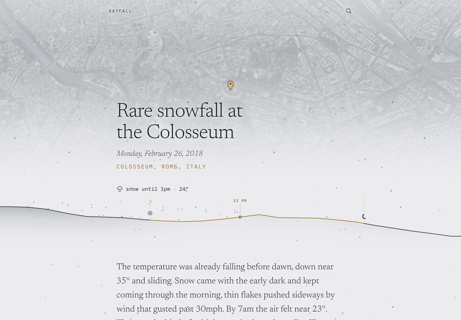
My favorite product bug: the Colosseum page for the day it famously snowed in Rome opened saying clear and cold, 25° — because the page opened at noon, and by noon the snow had stopped. Technically correct. Completely wrong.
A day is remembered by its exception, not its average.
The fix became that principle. The page now opens on the day's notable hour, chosen by hard precedence — snow beats storm beats rain beats fog beats grey beats clear — clamped to daylight, centered on the heaviest stretch. Two hours of snow on an otherwise clear day is the day. Every surface tells that one story from the first frame: the headline, the light, the photo treatment, even the link preview.
The page is lit by the day
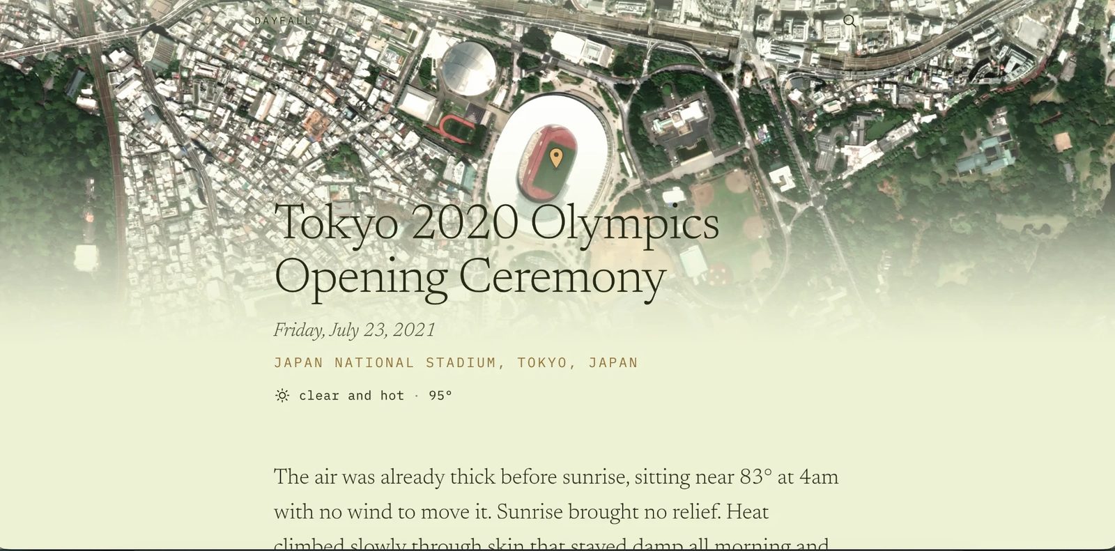
There's one axis of meaning in the whole design: light. Every color on the page derives from the weather — nothing is themed, everything is computed. Getting that derivation right was the most iterated system in the project, and every revision came from staring at a page and asking why it felt wrong:
- Heat is brightness, not color. Tokyo's 95° opening-ceremony page kept rendering faintly olive. Root cause: saturated warm hues at high lightness read green. But the deeper insight was physical — you can't see a temperature. A hot clear day is a brighter, harder version of a mild one, not a more yellow one. Heat now buys lightness, not hue. (Cold keeps its blue; a cold clear sky genuinely is blue. The asymmetry is the point.)
- Heat is felt, not seen. A 94° overcast day was glowing warm tan above prose describing flat grey light — the page contradicting its own testimony. Now cloud cover gates how much temperature color survives at all: a body under total cloud cannot see warmth.
- Contrast is engineered, not hoped for. Text color flips at the exact luminance where black and white both clear WCAG AA, and the derivation is verified across 768 sampled hours — sixteen days × forty-eight half-hours, every sample checked for contrast and for accidental greens and violets (both were real bugs this harness caught).
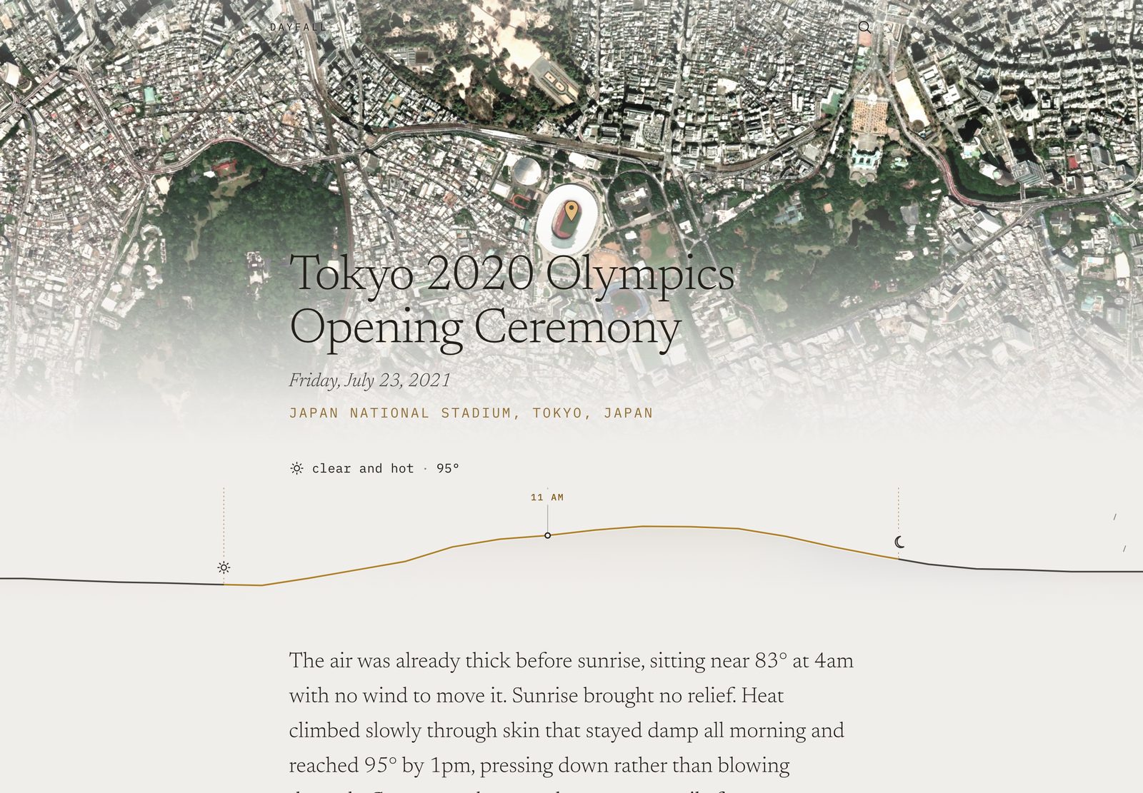
The ridge
The sky band went through three full designs. It started as what you'd expect — a little boxed chart of the day. It read as a widget, and a widget was exactly wrong on a page trying to be a memory.
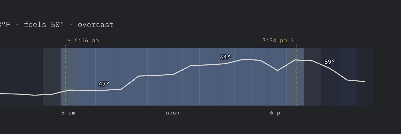
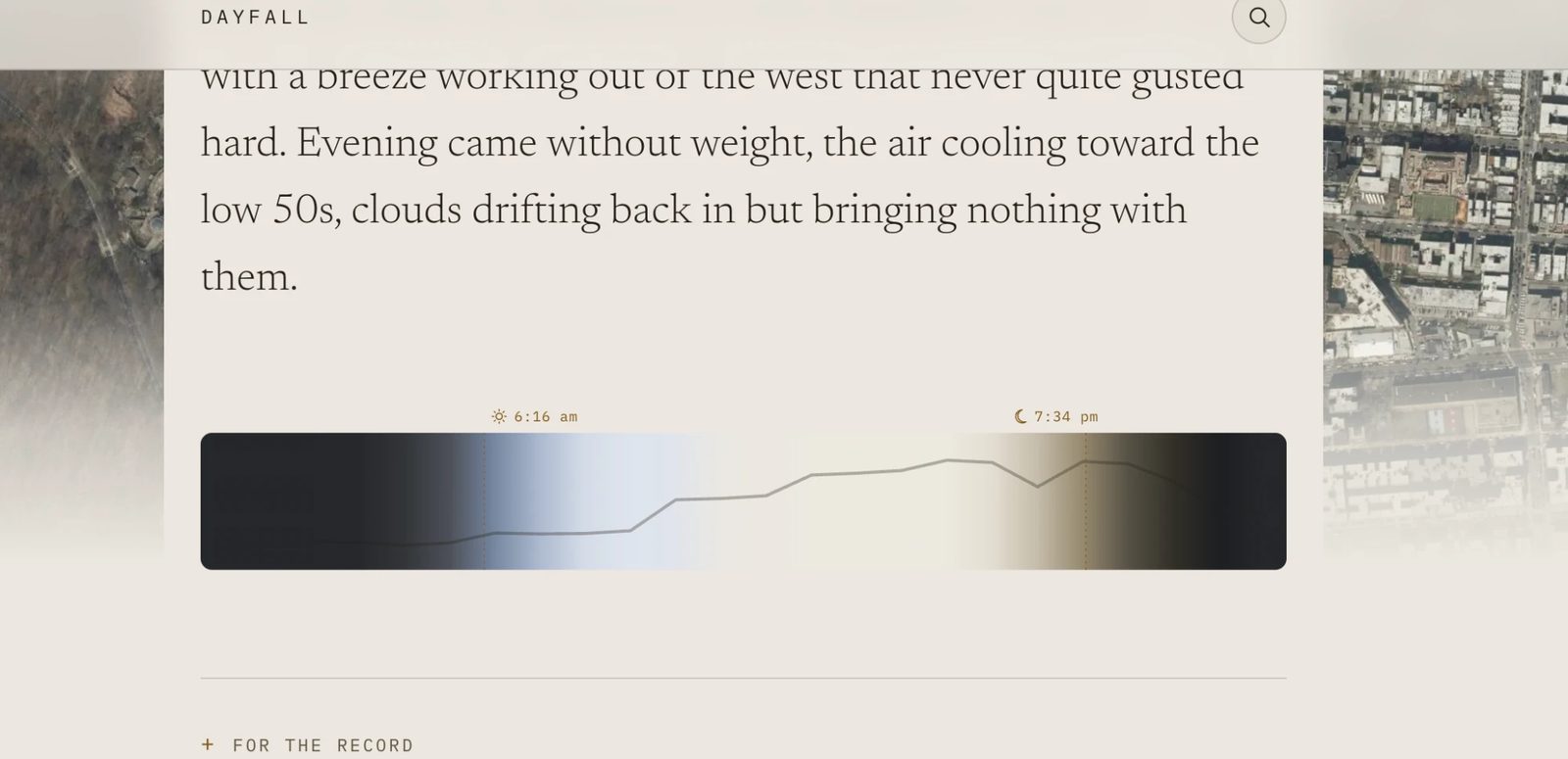
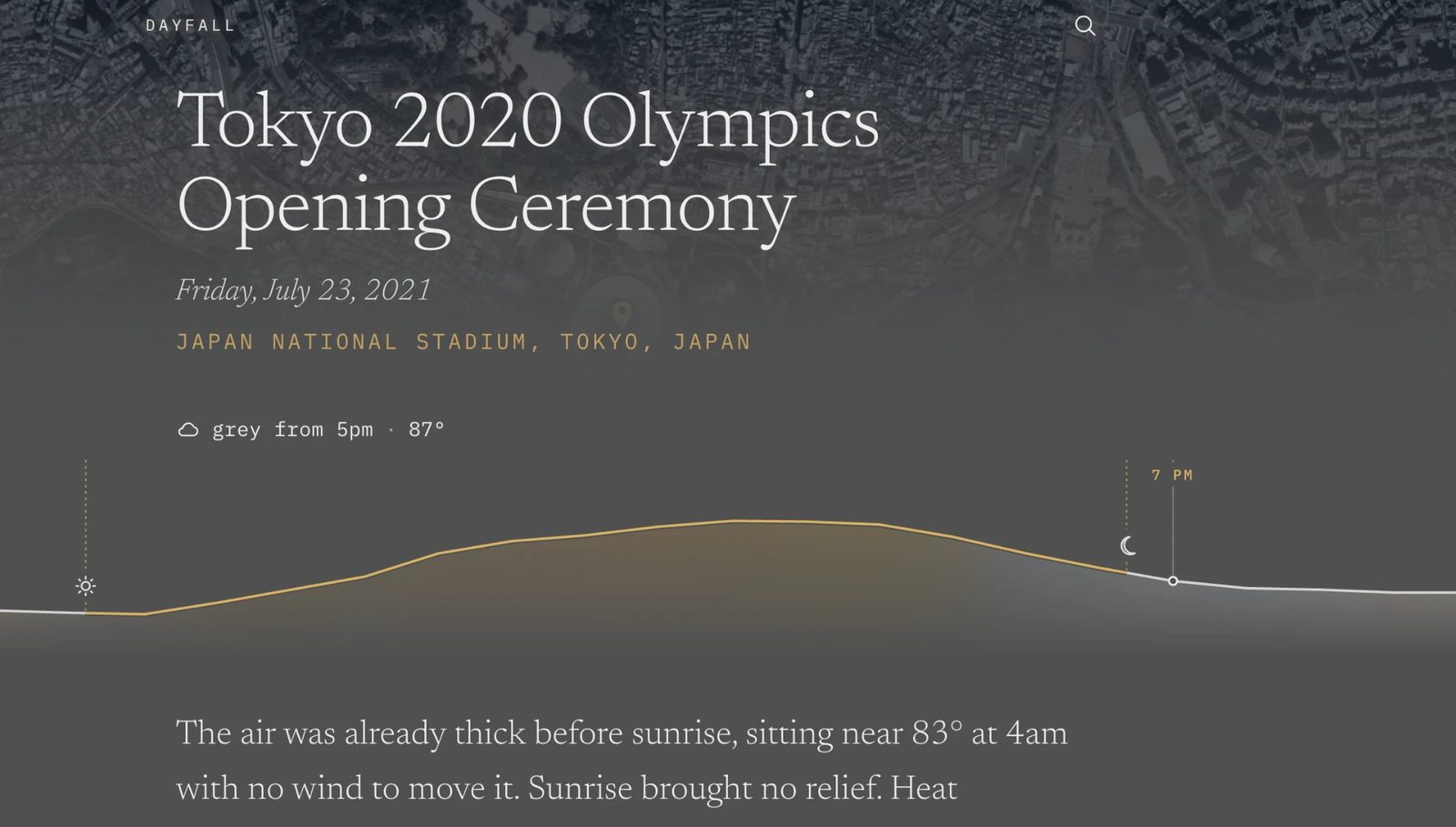
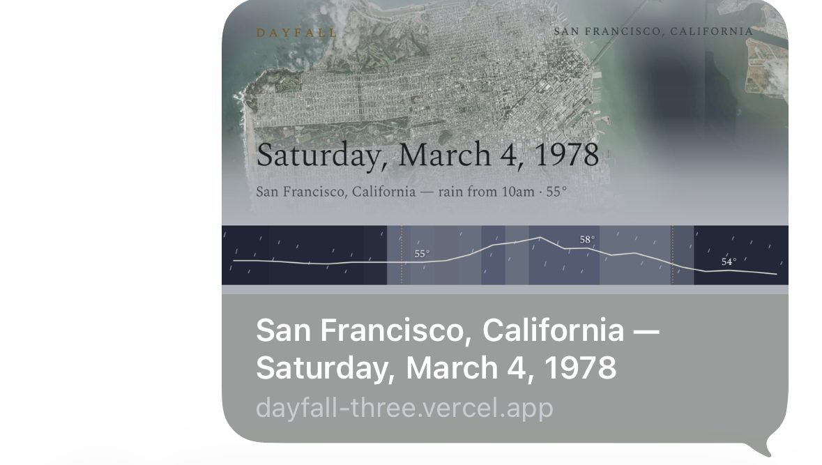
For the final version I worked with Claude Design, going back and forth in its canvas until we landed on what we called the ridge: the temperature contour as a horizon line, the day's light as the sky behind it, precipitation falling in the space above it — and no container at all. The fill dissolves downward into the page; the band has no bottom edge, it simply becomes the page. The handoff was a spec I dropped into the repo for Claude Code to implement, with one note I flagged as load-bearing: no chrome. No axis, no ticks, no border, no shadow. The moment any of it returns, the whole thing reverts to reading as a chart.
Three Claudes, one side project
The workflow turned out to be one of the most interesting parts:
- Claude Chat was the product critic. I'd render eight candidate pages, talk through what felt wrong, and walk away with a prioritized punch list — the notable-hour rule came out of one of those sessions.
- Claude Design owned the band's visual design and handed off an annotated spec.
- Claude Code built everything: implementation, verification in a real browser, commits, deploys — and wrote the living product brief that all three shared.
My job was creative direction and taste: deciding why, writing the laws, saying no. The brief became the medium — every hard-won rule ("the weather is never painted onto the photograph," "the prose is one voice in one colour") is written down with the failure that produced it, so no future session relitigates it. Two hundred and twelve commits in, the spec is the most valuable file in the repo — it is on its third version, and the accuracy machinery got a document of its own.
The freeze: a detective story
The best engineering story in the project started with a feature request I'd rate as innocent: can the background color ease smoothly while you scrub the band, instead of snapping?
Three easing systems later, fast scrubbing could freeze the entire page — frames seconds long, memory climbing past 1.8GB, sometimes a dead tab. What followed was a genuinely fun forensic hunt:
- Robot testing kept "confirming" fixes that a human hand broke in minutes. Lesson learned the hard way: browsers batch synthetic events but render trusted ones synchronously — an automated pointer storm literally cannot reproduce a human scrub.
- So we instrumented the page itself: a diagnostic overlay behind a URL flag showing frame gaps, heap growth, and which code was allocating, plus
?cut=flags to disable subsystems one at a time. I became the test harness, scrubbing violently on real hardware and sending screenshots. - The elimination lattice was conclusive: with every subsystem on and the animation off — perfectly healthy. Any per-frame style write from the animation loop — meltdown, with all of our own code idle. The profiler pinned the time inside React's commit machinery, feeding itself.
- The twist ending: I tested Safari to see if it was a Chrome bug. Safari froze identically, and the iOS attempt crashed the browser outright. Engine-independent — which points at the framework layer, not the browser.
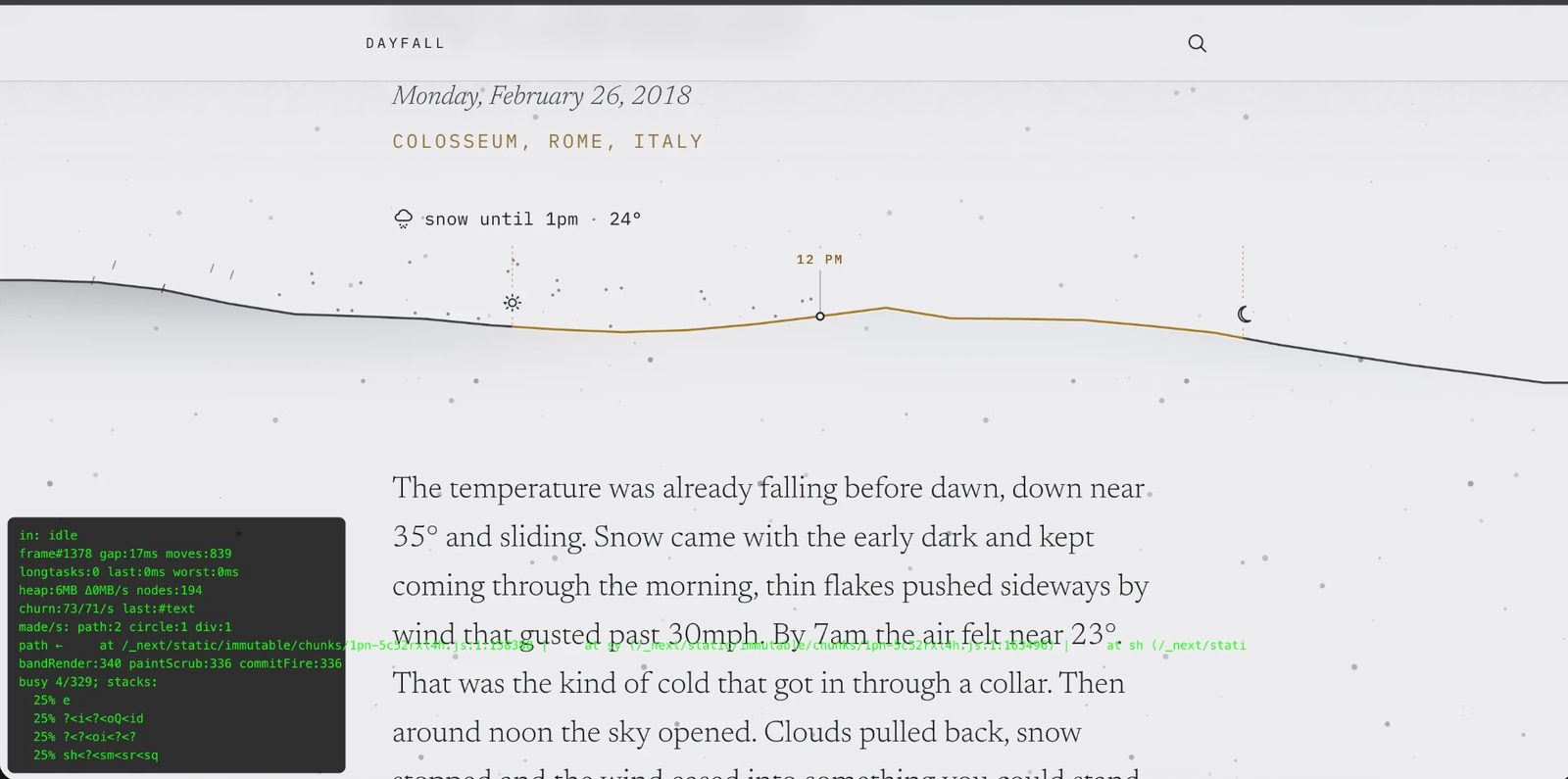
The resolution was a design decision disguised as a bug fix: the light snaps. The text color always snapped by design (it must flip at the readability boundary, never linger in the unreadable middle) — now the whole page changes in a single decisive frame, and honestly, it reads better. The constraint produced the right answer; the investigation continues as a minimal repro for an upstream report.
Honest data is a product feature
A detail I care about: the archive data (ERA5 reanalysis) averages weather over a ~31km grid, which smooths single-cell thunderstorms into drizzle. The famous "rain show" Taylor Swift played in Nashville — roughly two inches of rain at the stadium — records as half an inch in the archive. For a memory product, quietly rendering someone's unforgettable storm as a mild wet afternoon is a betrayal. So every page carries an era note ("An impression of the day, not a measurement" for pre-1950 dates), the prose softens numbers on old dates, and convective days are an open honesty question I've written down rather than papered over.
530 days, checked against the sky's own record
The second month was a different project wearing the first one's clothes. Personal days are private and infinite; a public day — the handover of Hong Kong, the night of the Centennial Park bombing, Bolt's 9.69 — is one page that many people were at. So Dayfall grew a corpus: 530 public days from 1940 to this summer, each with its own permanent page, each with a paragraph written by hand under the same blindfold rules the model works to, and a one- or two-sentence "As it happened" note underneath it.
The rule for the notes came from reading the first fifteen: the good ones are a small, documented, human detail that puts you in the room — the Cubs' rain-delay clubhouse speech, Prince playing Purple Rain in an actual downpour, Bowie reciting the Lord's Prayer at Wembley. The weak ones restate the sky the paragraph already described. Titles got a rule of their own after I hit one that read "Athletics begins in Atlanta": a title says what happened, not the sport or the city.
Accuracy of the day is more important than the writing. People who experienced those days need it remembered back to them properly, or they lose trust in the whole thing.
I wrote that into the brief as law, and it reorganised everything. The archive is a weather model. Models miss thunderstorms, invent drizzle, and put a coastal airport's temperature over an inland city. So every corpus day now gets a second opinion from NOAA, in two layers:
- The station's word. The nearest daily station within 30 km: rain, snow, high, low, beside the model's. Disagreements are flagged — rain the model missed, rain it invented, a high or low eight degrees off — and the paragraph is written from what was measured. Thirty-eight days were rewritten on the first pass alone.
- The station's hours. Where NOAA has hourly observations, they are laid over the model before anything is drawn — the sky band, the labels, the headline condition, the record, the paragraph — so the whole page tells the day the station saw, not just the prose. 384 of the 530 days are driven by a station's hours. The page says so in the note under the record: From the Fulton Co Airport Brow station, 7 mi away.
Getting the hourly layer to tell the truth was its own week of rules, each from a page that lied: a station that never files rainfall can't vouch for a dry hour; a wet weather code keeps an amount even when the gauge is empty; a 24-hour total smeared evenly across the hours is not a rainstorm (Hong Kong's handover day showed 8.9 inches at 0.4 an hour); a Manhattan heliport reporting 135 inches of rain is a decoding error, not a flood; a station that reads 47° for twenty-four hours straight in Turin in February is broken.
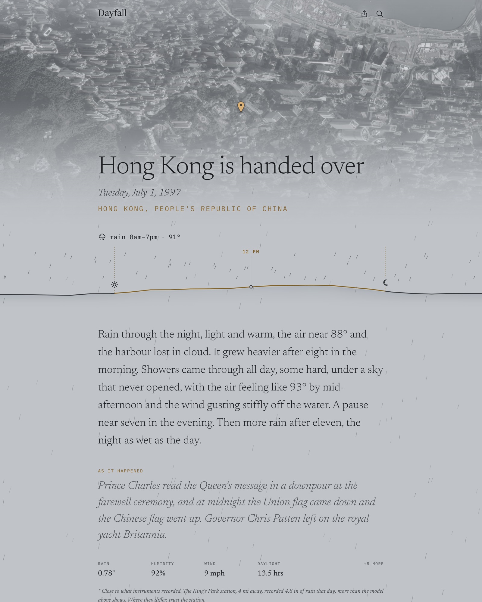
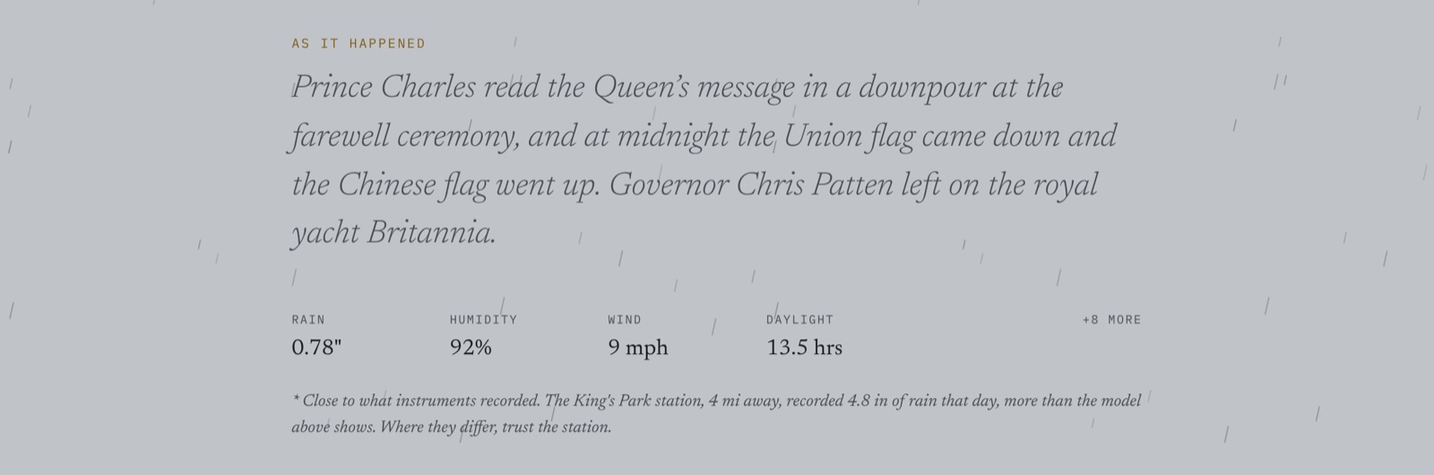
The last check was the one I should have built first. Reading ten pages before opening the site to Google, I found that half the paragraphs were a few degrees off the band beneath them — 52° in the prose, 49° on the ridge. The cause was archaeological: the earliest rounds had been written to air temperature before the feels-like rule existed, and the band shows feels-like. So there is now an audit that reads every paragraph against the exact hours its page renders, and one rule with no tolerance in it:
Every temperature in the paragraph is an hour on the band.
Eighty-nine paragraphs were re-numbered; the insert step refuses anything that breaks the rule; and wind, which had been "gusts past 28 mph" to a reader who has no idea what 28 mph feels like, became words — a stiff breeze, a strong wind, a hard wind, gusts near gale force.
Then robots, a sitemap of 531 URLs, and Search Console. Personal moments stay out of the index — place × date is an infinite doorway space — and the corpus is the site Google sees. You can browse every day in the corpus from one page.
For the record, redrawn
The record line was the dashboard that kept trying to come back. It had a heading, a rule above it, and a table of eleven numbers behind a tap. The current version has none of that. Under the note sit four measurements with no heading at all, chosen per day by how much they say about that day: a measurement scores on its distance from unremarkable, and one the day gave nothing to say — rain 0.00" on a June afternoon in Phoenix — is not offered. Phoenix leads with humidity 13%. London on 5 December 1952 leads with humidity 97% and wind 5 mph, which is the entire reason the Great Smog happened.
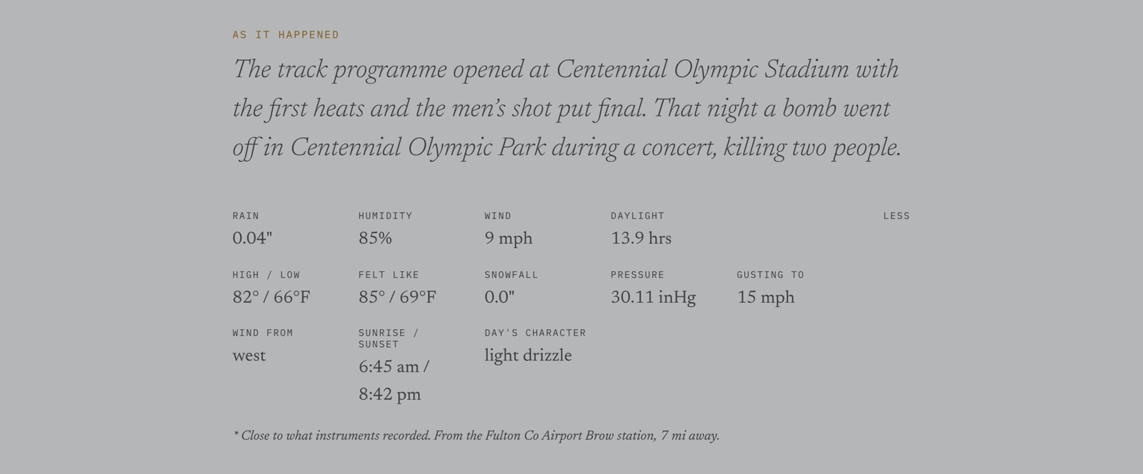
Two smaller rules came out of the same week. Rain means rain: the row had been reading total precipitation, which folds in the water a day's snow melts down to, so the blizzard of 23 January 2016 showed "Rain 1.73"" on a day that recorded twelve inches of snow and no rain at all. And amber is daylight, so it goes only on what the day owns — the place line, the condition line, the band — and everything that belongs to Dayfall is ink.
Small things I'm fond of
- A cold arrival takes two model calls in series, so the page reveals in ~5 seconds and the prose streams in after, into a slot that says "Writing the day —". A finished page with one quiet gap reads as still writing; a spinner reads as broken.
- The prose is drafted twice in parallel and the draft that fits the comma budget wins — halving the cost of the model's habit of blowing the budget.
- The link preview is a full composition: the giant date, the day's palette, the satellite photo, and the ridge drawn at the notable hour.
- The sun's timestamps carry a date, and above the Arctic circle it is load-bearing. Reykjavík on the 2010 solstice sets at two minutes past midnight the next day; reading only the hour field made sunset come before sunrise, the lit window empty, and the whole page went down. Tromsø's midnight sun was the same wound the other way round and quieter: the longest day of the year lit as unbroken night, no error anywhere. One shared sun module now, checked against sixty real archive days.
- I beta-tested by sending links to my family and watching the server logs live. Within minutes: a search that failed silently taught me my logging had a gap, and my brother's first search was a test of whether I could really see what people typed. (I could. It's in the privacy note now: searches live in the log for about an hour, stored nowhere.)
What's next
The name is settled — Dayfall, at dayfall.app. The print door is live as a fake door (leave an email, we'll save you one), waiting for the fulfilment side. Next is the footer: five specific days you can go to in one tap from any page — yesterday, tomorrow, and three other years at the same place — because a year is a link but a morning is a memory. Then unit toggles, a client-side history of the days you've visited, and the print itself: a day as a physical keepsake, the giant date, the testimony, the ridge as artwork. The kind of thing you'd frame for someone about the day they were born.