How much care a footer deserves.
How Dayfall's footer went from a blank text field to the most-considered thirty lines on the page — twelve rounds of exploration, one colour rule bent on purpose, and three failed attempts to animate three dots.
The last thing I wrote about Dayfall ended with a note about what was next: the footer — five specific days you can go to in one tap from any page. This is that, and it took far longer than five links deserve.
The complaint that started it was mine, from using my own site. You look up a day. You read the paragraph, you scrub the band, you open the record. Then you scroll to the bottom and the page hands you an empty text box and the words You remember the day. Feel it again. It's a lovely line, and it's asking you to do the hardest possible thing: think of another day, from nothing, and type it.
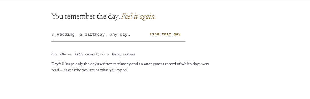
A share-driven product can survive that. A product you're meant to browse can't — and Dayfall is: you can browse every day in the corpus, and the footer is how you get from one to the next. So the brief was two-sided: make it possible to reach another day without typing, and make the footer feel like an invitation rather than a form.
The first instinct was the wrong one
My first thought — and Claude Chat's, when I asked — was to put date navigation near the date. The year in the headline becomes a dial. A strip of neighbouring days sits under the band, each one a thin sky you can tap. Both are defensible. Both are how a weather app would do it.
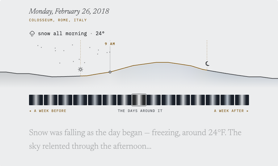
I built four versions of that idea before killing all of them, and the reason is a rule I should have known already:
The day gets the page to itself.
The whole product is one moment, told once, from every surface at once. The instant there's a picker in the middle of it, the reader is choosing instead of remembering. Navigation goes after the day is finished — in the footer, where the reading is over — or it goes in the search field at the top, where it's already a control.
That was round one of twelve. The rest of them are all footer.
A list is not a footer
The obvious version came next: the five days as five lines. Yesterday and tomorrow, then three other years at the same place, each with its condition and how it felt.
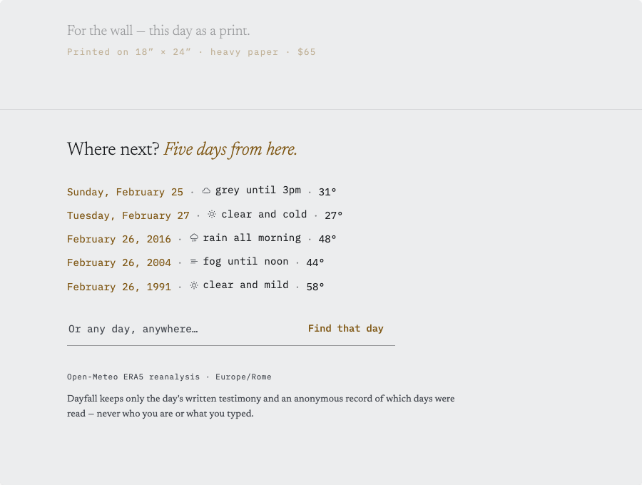
It's a fine block of information and a bad end to a page. Everything above it is prose; this is a table wearing prose's typeface. And five rows of identical shape is precisely the failure the tail of the page had just been redesigned to fix — the wall of same-shaped sections that made the middle of the page feel like a form.
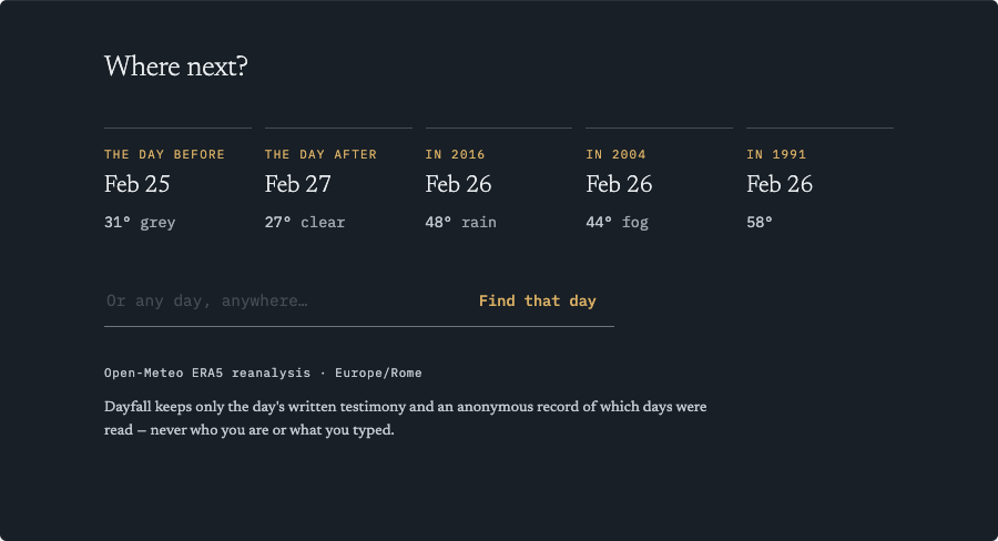
So I tried the opposite of a list. Five tiles in a row, because the page has no rows in it anywhere else:
Then two that came from asking "what if the footer stops being the same surface?":
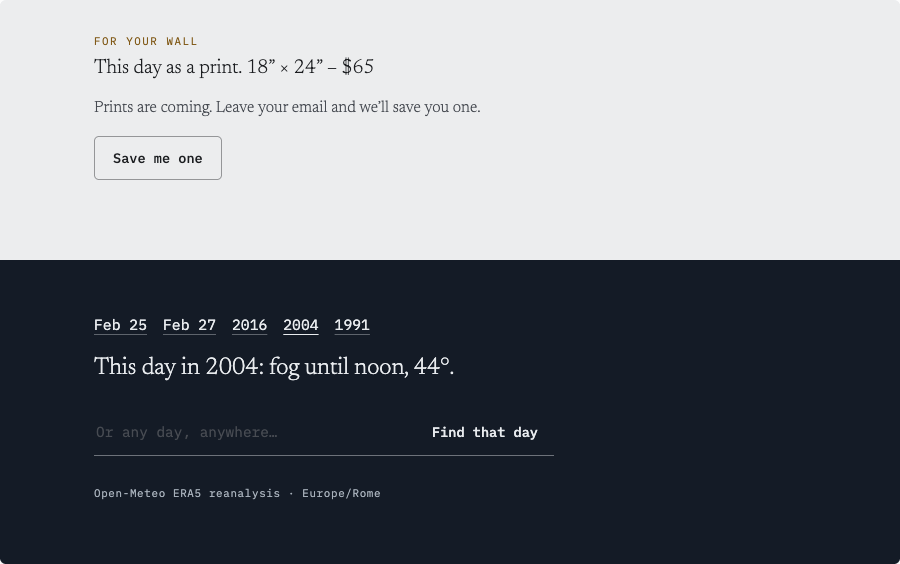
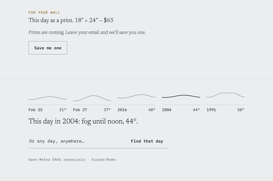
I liked both of these and neither survived contact with the rest of the design.
Nightfall broke a rule the page had already settled: the whole thing is one continuous derivation of the day's light, dissolving from photo to prose without a hard edge anywhere. A navy slab at the bottom is a hard finish, and we'd already decided against hard finishes when the band lost its container. Everything flows together is not a preference here, it's the structure.
Five skies failed a harder test: the lines didn't mean anything. In the band, the ridge is load-bearing — that curve is the temperature, that gap is the daylight, and you can scrub it. Shrunk to 120 pixels with no scale and no interaction, five curves are decoration that looks like data. The page's most trustworthy element, used dishonestly. That's worse than a list.
Two registers, not one
What finally worked was giving up on treating the five days as one set.
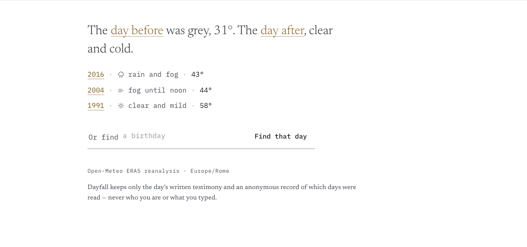
They aren't one set. Yesterday and tomorrow are a comparison — you want to know whether the snow was a one-day thing. The other years are a set you scan — you're looking for one that sounds different from the day you just read. Those are different questions, so they get different registers: the pair becomes a sentence in the page's serif, and the years become three short monospace lines under it.
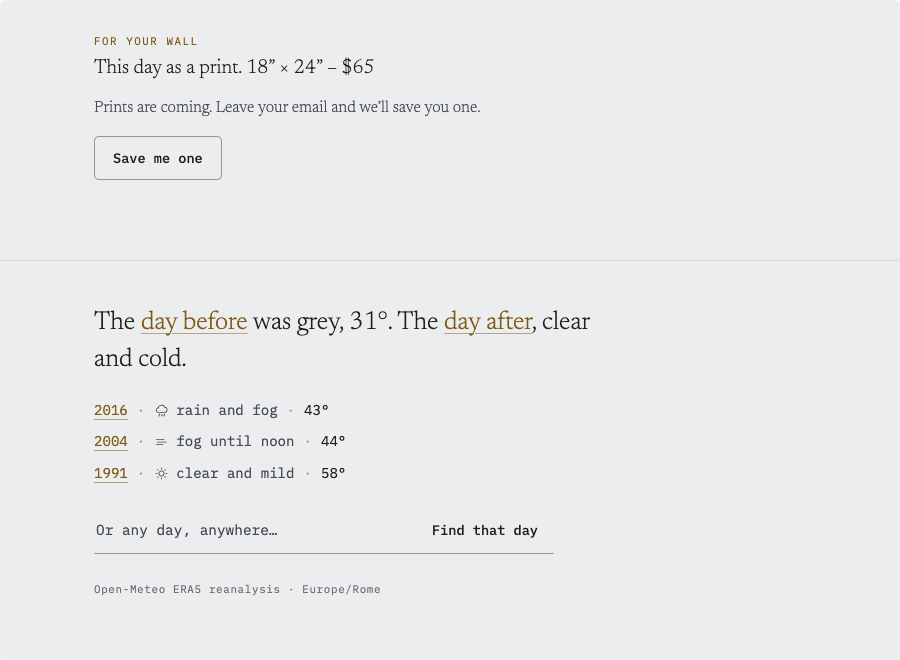
Three lines instead of five is most of the fix. Five reads as a table; three reads as a footnote with links in it. And putting the pair in prose means the footer opens in the same voice as the paragraph 400 pixels above it, which is the only reason it doesn't feel like a different website.
Amber is daylight, except when it's a door
The page has exactly one accent colour, and one rule for it, written down weeks earlier after the colour had quietly accumulated five different jobs: amber is daylight, so it goes only on what the day owns — the place line, the condition line, the band, the pin. Everything belonging to Dayfall-the-product is ink. Buttons are ink. The record's control is ink.
Which made the footer links a genuine problem. They're navigation, so by the rule they should be ink. But they're navigation to another day, and that's the one thing on the page that is entirely about the day.
I let the rule bend, with an amendment:
A link to another day wears the day's colour.
Five amber links in the footer, and nothing else amber below the aside.
Then the amendment immediately taught me something. In amber alone, the links didn't read as links at all — they read as emphasised words, which is exactly what amber means everywhere else on the page. The fix was an underline, and it turns out the underline is the load-bearing part: once the five links are underlined, the amber is just confirming what the underline already said. Worth remembering the next time I'm tempted to signal interactivity with colour alone.
The field that's never blank
That left the original complaint — the empty box — and the answer took two more rounds. I wrote out eight opening lines for the field and nine placeholder texts and tried them in pairs, because they can't be judged separately: an intro that states the scope makes a scope-stating placeholder redundant.
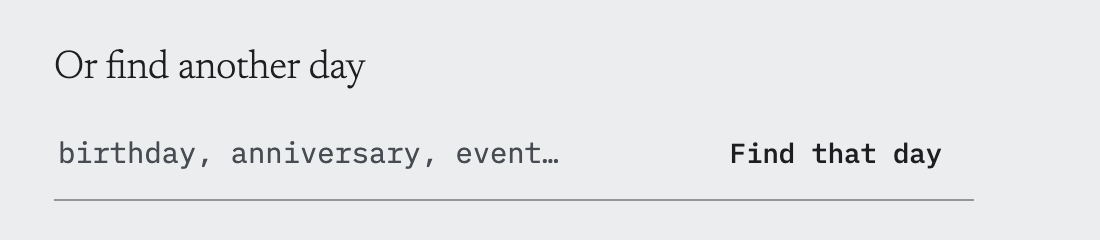
The pairing I picked collapses both into one thing. There's no heading above the field. The hint lives inside it, and it cycles:
Or find holds still; only the noun moves. Each phrase comes down and in, settles for a beat, and then the three dots arrive one at a time — dot, dot, dot — before the whole phrase leaves downward and the next one comes down. Everything the losing pair was doing across two lines — the invitation, the scope, the examples — is now one line in one register, and because it moves, it never sits still long enough to become a heading.
The reason it's four phrases and not one line of three nouns: the real risk with this field isn't that people don't know what to type, it's that they assume only famous days are in the archive. "Birthday" and "anniversary" have to appear, and appear as things you would search, not as a taxonomy. The same field that finds D-Day finds the weather on a day in your family's history. And the dots aren't decoration — they're the pause made visible, which is why they can't travel in with the word.
Three ways to animate three dots, two of them wrong
This is the part I'd have skipped a year ago, and it's the most useful thing in the post.
Animating three periods in sequence is trivially easy to describe and I got it wrong three times.
- Attempt one: a chain of timeouts. Seven steps — settle, dot, dot, dot, hold, exit, reset — each scheduling the next. It played correctly roughly one cycle in three. Two problems: any remount left an orphaned chain running alongside the new one, both writing the same state out of phase, and each step's delay was measured from inside a callback that then triggered a render, so 210ms steps landed 335ms apart or got skipped entirely.
- Attempt two: one monotonic clock. Derive everything from elapsed time — a clock can't drift or skip a beat — and sample it with a timer sixteen times a second. This is the right idea and it made things worse. Sampling meant re-rendering the page to move a dot, and the page is three thousand nodes: only about a quarter of those renders actually landed a style change, so the dot steps were still skipped about half the time, and the whole document dropped from 60fps to 21 for as long as the tab was open. I'd built a global performance regression to animate three periods.
- Attempt three: CSS, with the stagger in the wrong place. All four phrases rendered stacked, each owning a window of one long loop, and each dot given its own
animation-delay. Correct on the first loop, broken forever after — becauseanimation-delayoffsets the first iteration only. From loop two the dots restarted already lit and flickered in place instead of building.
What works: the stagger belongs in the keyframe percentages, not the delay. Three keyframe sets, each dark until its moment, lit through the hold, dark again before the exit and dark to the end of the cycle — so every iteration starts from the same place. Each element's delay is just its phrase's slot. No JavaScript runs per frame; nothing re-renders; the whole thing lives on the compositor.
The lesson generalises past this footer, and it's close to the one the background-easing freeze taught me:
If an animation needs the framework to run, the framework becomes the animation's bottleneck.
Motion that can be expressed as a declarative cycle should be, and the tell that you've mis-expressed it is a cadence that's right once and wrong afterwards.
What it cost, and what it bought
Twelve rounds of exploration for a footer is either absurd or exactly right, depending on whether you think the footer is furniture. On a page whose entire job is to be read once and then shared, the footer is the only thing standing between one day and the next one. It's the browse mechanic. It deserved the rounds.
What's actually there now is thirty lines of markup with no heading, no panel, no card, and no picker: a sentence, three lines, and a field that talks. The rules it produced are in the brief, each with the failure that earned it — the day gets the page to itself, a link to another day wears the day's colour, the footer is not a different surface, three lines, never five.
Next is the data behind it. Every one of those five days needs a real condition and a real felt temperature, which means a batched lookup and a decision I've deferred twice: for a public day, rank the years by how differently they felt; for a personal day, use milestones — last year, five years on, ten years on — and say so in words, because ten years on lands where 2016 doesn't.